matplotlib でヒストグラムを描く

matplotlib でヒストグラムを描くには、hist を使う。ビンの数や範囲の指定、対数目盛や軸方向を水平にする等のオプションがある。

アウトプット

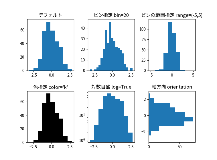
hist のオプションをいくつか試した。結果が下図。

ポイント

配列を渡せば良い

hist に配列を渡しさえすれば、デフォルトのヒストグラム(上図の左上)ができる。

# 乱数の生成                                                                                                                                                                          
r = np.random.randn(300)

# 上左                                                                                                                                                                                
ax1 = fig.add_subplot(2, 3, 1)
ax1.set_title('デフォルト')
ax1.hist(r)

各種オプションは、hist の引数で指定

ビンの数を指定するには、bins=20 のように hist の引数にする。デフォルトだと 10 ビン。データの数が多く、細かい分布を調べられる際にビンを指定すると良い。

ビン範囲はrange=(min,max) のように指定する。色は color=’色’ で、対数目盛は log=True 、軸方向を水平にするには orientation=’horizontal’ を引数にする。

コード全文

#!/usr/bin/env python3.8                                                                                                                                                              
# -*- coding: utf-8 -*-                                                                                                                                                               
import matplotlib.pyplot as plt
import numpy as np

# 日本語フォント用                                                                                                                                                                    
from matplotlib import rcParams
rcParams['font.sans-serif'] = ['Noto Sans CJK JP']

# ウィンドウの作成                                                                                                                                                                    
fig = plt.figure()

# 乱数の生成                                                                                                                                                                          
r = np.random.randn(300)

# 上左                                                                                                                                                                                
ax1 = fig.add_subplot(2, 3, 1)
ax1.set_title('デフォルト')
ax1.hist(r)

# 上中                                                                                                                                                                                
ax2 = fig.add_subplot(2, 3, 2)
ax2.set_title('ビン指定 bin=20')
ax2.hist(r, bins=20)

# 上右                                                                                                                                                                                
ax3 = fig.add_subplot(2, 3, 3)
ax3.set_title('ビンの範囲指定 range=(-5,5)')
ax3.hist(r, range=(-5,5))

# 下左                                                                                                                                                                                
ax4 = fig.add_subplot(2, 3, 4)
ax4.set_title("色指定 color='k'")
ax4.hist(r, color='k')

# 下中                                                                                                                                                                                
ax5 = fig.add_subplot(2, 3, 5)
ax5.set_title("対数目盛 log=True")
ax5.hist(r, log=True)

# 下右                                                                                                                                                                                
ax6 = fig.add_subplot(2, 3, 6)
ax6.set_title("軸方向 orientation")
ax6.hist(r, orientation='horizontal')

# サブプロットの間のスペースを調整                                                                                                                                                    
plt.subplots_adjust(wspace=0.3, hspace=0.4)

# 表示                                                                                                                                                                                
plt.show()

コメント

タイトルとURLをコピーしました